
Key takeaways
Short answer: A run chart shows data over time. A control chart adds statistically derived upper and lower control limits to detect special-cause variation. Run charts answer "what is changing?"; control charts answer "is this process in statistical control?" Both are useful — the right one depends on whether you need simple trend visualization or genuine signal-versus-noise discrimination. See also cpk vs ppk.
A run chart is the simplest time-series view: the measurement on the vertical axis, time on the horizontal, points connected in order. It reveals trends, cycles and shifts at a glance, but it has no statistical limits, so it cannot tell a meaningful change from normal noise.
A control chart takes the run chart and adds upper and lower control limits derived from the process's own variation, plus rules for detecting special causes. Now a point outside the limits, or a non-random pattern within them, is a genuine signal worth investigating — not just a wiggle.
A fill weight bounces around on a run chart: 248, 252, 247, 253, 249. The operator, seeing 253, tightens the process — but on a control chart with limits at 244 and 256, every one of those points is normal common-cause variation, so the adjustment actually adds variation by chasing noise. Later a point hits 258, outside the upper limit; the control chart flags it as a real special cause worth investigating, while the run chart would have treated it like every other wiggle. The limits turned guesswork into a decision rule.
1. Reacting to every run-chart wiggle. Without limits you cannot tell signal from noise, so you chase noise.
2. Control charts on an unstable process. Limits computed from chaos mislead.
3. Setting limits from the spec. Control limits come from process data, not the specification.
4. Not acting on real signals. An out-of-control point with no investigation wastes the chart.
OEE Quality, Performance and Availability are all candidates for control charting. Plants that chart only run charts may miss systematic shifts hiding inside normal-looking variation — the control limits are what turn an OEE trend into an actionable signal.
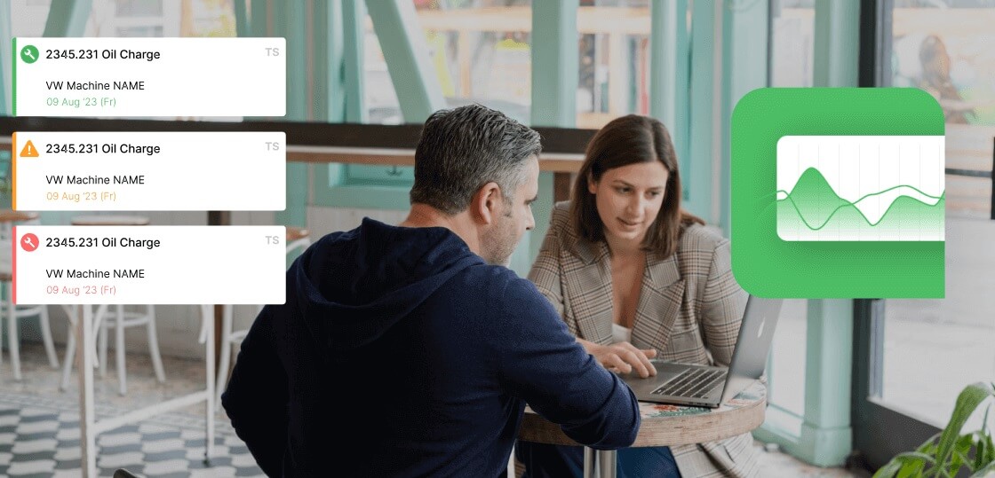
Fabrico produces run charts by default and supports control limits for advanced users, so you can move from "what is changing" to "is this in control." Book a demo to see SPC-ready OEE data.
No — choose for the question; a run chart is fine for simple trend visualization.
Typically 25-30 stable points to estimate limits reliably.
Yes, with training to read signals correctly.
The process's own variation — not the specification.
Then it is a run chart, regardless of what it is labelled.
Programați o întâlnire individuală cu experții noștri sau înscrieți-vă direct în planul nostru gratuit.
Nu este nevoie de card de credit!