Menu
How to Build a Powerful OEE Spreadsheet (And Why You'll Outgrow It)

How to Build a Powerful OEE Spreadsheet (And Why You'll Outgrow It)

Key Takeaways

  • This guide will walk you through the exact steps to build a functional OEE tracking spreadsheet using simple formulas.

  • The three main components you'll build are a Data Entry Log, a Calculation Sheet, and a Dashboard.

  • While a spreadsheet is a good educational tool, you will quickly discover its limitations in real-time data, accuracy, and its total inability to connect your OEE "diagnosis" to a "cure."

How to Build a Powerful OEE Spreadsheet (And Why You'll Outgrow It)

Step 1: Building Your 'Data Entry' Log

This is the foundation of your entire spreadsheet. It's the sheet where your operators or supervisors will log raw production data at the end of every shift.

The Core Columns

Create a new sheet named Data Entry. Set up the following columns.

Column Description
Date The date the shift was run.
Shift Which shift is being logged (e.g., 1, 2, or 3).
Machine The name or ID of the machine being tracked.
Product The product or SKU that was produced.
Ideal Cycle Time (Sec) The theoretical fastest time to make one part, in seconds.
Scheduled Time (Mins) Total shift time in minutes (e.g., 480 for an 8-hour shift).
Planned Downtime (Mins) Total time for planned stops like breaks and lunch.
Unplanned Downtime (Mins) Total time for unplanned stops like breakdowns.
Total Units Produced The total number of parts made, both good and bad.
Rejected Units The number of parts that were scrapped or needed rework.


The Manual Trap: "Garbage In, Garbage Out"

This is the first and biggest weakness of any spreadsheet. The value of your entire system is 100% dependent on your team accurately and diligently filling out this log.

This manual process is a trap. It's prone to "guesstimated" downtime numbers, simple typos, and becomes a major administrative burden on your team, which can lead to pencil-whipping and inaccurate data.

Step 2: Building Your 'Calculation' Sheet

This sheet will automatically pull the raw data from your Data Entry log and perform all the necessary OEE calculations.

The Formulas You Need

Create a new sheet named Calculations. For each row of data on your Data Entry sheet, this sheet will have a corresponding row that calculates the OEE scores.

Use this table to enter the formulas. (Assuming your first row of data is on row 2 of the Data Entry sheet).

Metric Formula
Planned Production Time = 'Data Entry'!G2 - 'Data Entry'!H2
Run Time = [Planned Production Time Cell] - 'Data Entry'!I2
Availability = [Run Time Cell] / [Planned Production Time Cell]
Performance = (('Data Entry'!F2 / 60) * 'Data Entry'!J2) / [Run Time Cell]
Quality = ('Data Entry'!J2 - 'Data Entry'!K2) / 'Data Entry'!J2
OEE = [Availability Cell] * [Performance Cell] * [Quality Cell]


The Manual Trap: The History Lesson

Even though the calculation is now automated, the result is always a history lesson.

It's a perfect report of what your OEE was yesterday. It cannot tell you what your OEE is right now. This makes proactive, in-the-moment decision-making impossible.

Step 3: Building Your 'Dashboard' Sheet

This is your final visualization layer, where you will turn the numbers from the Calculations sheet into simple charts.

The Essential Charts

Create a new sheet named Dashboard. Use Excel's chart tools to create a few simple but powerful visuals.

Chart 1: OEE Trend
Create a line chart that tracks the final OEE score over the last 30 days. This will show you if your overall performance is improving or declining.

Chart 2: Daily A, P, Q Breakdown
Create a bar chart that shows the three component scores—Availability, Performance, and Quality—for the previous day. This will tell you which category of loss was your biggest problem.

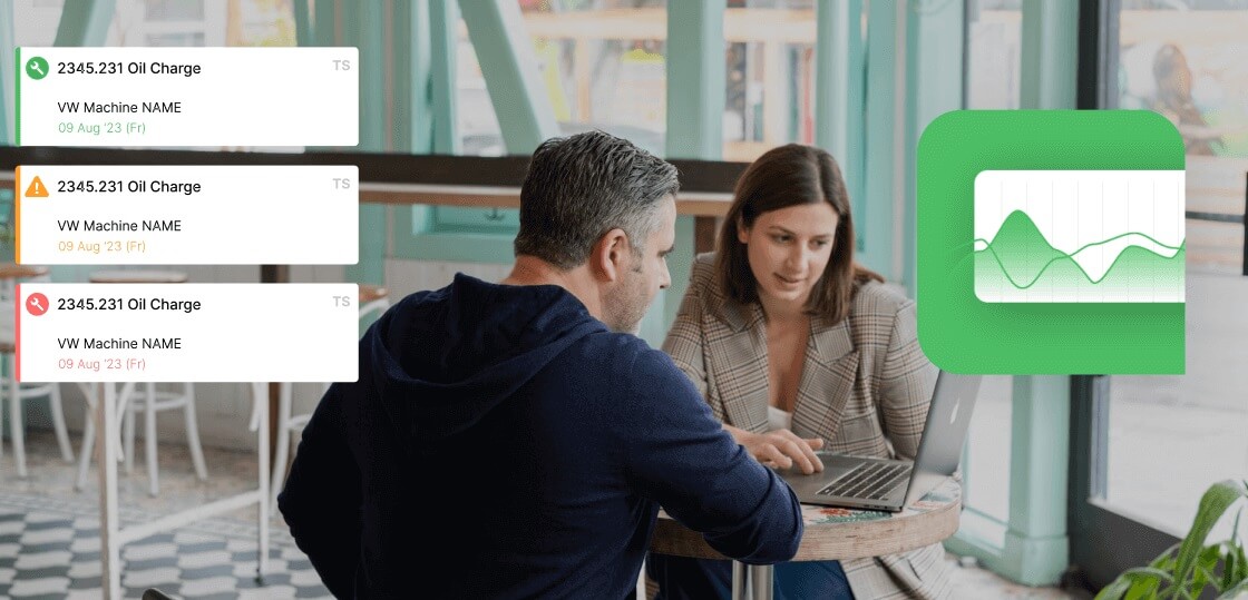
The Manual Trap: The Dead End

This is the ultimate limitation of a spreadsheet. When Mike sees a big dip in the Availability chart from yesterday (the diagnosis), what happens next?

Nothing. The spreadsheet is a dead end.

He still has to manually pick up the phone, create a paper work order, and start a chaotic, untraceable process to get the "cure." The spreadsheet cannot connect the problem to the solution.

Take a live tour with a product expert
Schedule a Demo

You've Built It. Now, Here's Why You'll Outgrow It.

This spreadsheet is a fantastic educational tool. But as a long-term solution, it will fail, for three main reasons.

  • It's not real-time. You are always looking at the past.

  • It's prone to human error. The data is only as good as the manual entry.

  • It has no integrated cure. It's a "diagnosis-only" system that is completely disconnected from your maintenance response.

The Next Step: From a Spreadsheet to a System

This spreadsheet is not a failure; it's a successful first step. It has proven the value of tracking OEE and has likely already highlighted some of your biggest problem areas.

Now that the value of the diagnosis is clear, the next logical step is to upgrade from a manual, educational tool to a professional, automated system.

A platform like Fabrico automates every manual trap we just highlighted. Most importantly, it connects the OEE diagnosis directly to the CMMS cure, all in one user-friendly platform.

Frequently Asked Questions (FAQ)

Is there a good free OEE spreadsheet template I can download?

Many companies offer free templates online. While they can save you the setup time, they all suffer from the same fundamental limitations: they are not real-time, they rely on manual data entry, and they are disconnected from your maintenance workflow.

How do I track downtime reasons in an Excel spreadsheet?

You would need to add more columns to your Data Entry log for each of your top downtime reasons and have operators manually enter the minutes for each one. This makes the data entry process even more complex and prone to error.

What is the biggest mistake people make when tracking OEE in Excel?

The biggest mistake is trusting the data too much. Without an automated system, the data is always an estimate. It's good for seeing general trends, but it's not accurate enough for making critical, high-stakes business decisions.

Stop Being a Spreadsheet Admin. Start Being an Improvement Leader.

This spreadsheet is a powerful tool for learning. But it will quickly turn your best managers into full-time data-entry clerks.

A modern platform automates the administrative work. It frees up your team to focus on what they do best: making improvements that drive the bottom line.

Ready to see how our platform automates every step in this guide and connects it directly to your maintenance team?

Book a personalized demo of Fabrico today.

Latest from our blog

Still Wondering?
Check for Yourself!
Still Wondering?

Schedule a 1-to-1 meeting with our experts or directly enroll in our Free Plan.
No Credit Card required!

By clicking the Accept button, you are giving your consent to the use of cookies when accessing this website and utilizing our services. To learn more about how cookies are used and managed, please refer to our Privacy Policy and Cookies Declaration