For decades, OEE (Overall Equipment Effectiveness) software was the domain of engineers.
It was complex, ugly, and required a degree in data science to understand. It lived in the server room, far away from the factory floor.
But the most important person in the OEE equation isn't the engineer; it's the Operator.
The Operator is the one who knows why the machine stopped. If the software is clunky, slow, or confusing, the Operator will simply ignore it (or select "Other" for every downtime reason).
To get accurate data, you need software that respects the Operator's time.
You need a "Consumer-Grade" experience in an industrial package.
Here are the 5 most user-friendly OEE tools that prioritize adoption and simplicity.
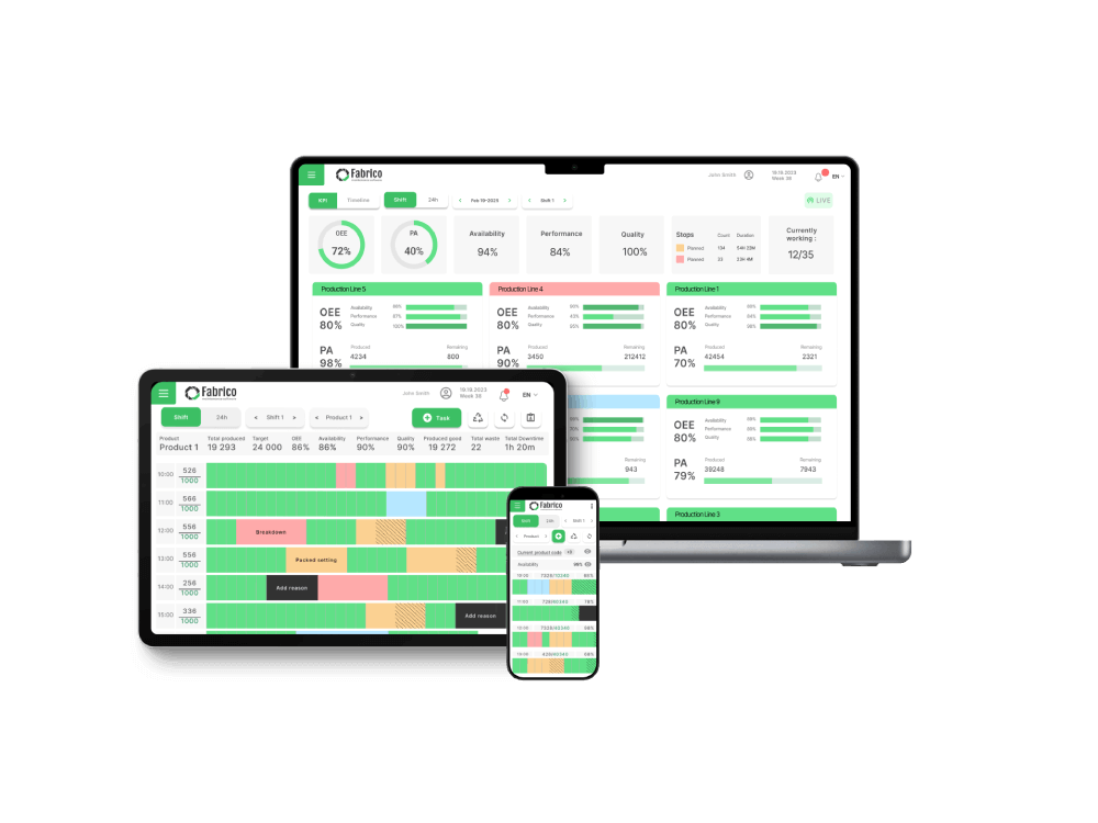
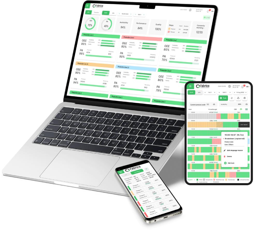
1. Fabrico (Best for Visual Inputs & Actionable Data)
Fabrico is designed with a "Shop-Floor-First" philosophy.
We understand that an operator's job is to run the machine, not to be a data entry clerk. Our interface creates the path of least resistance for data collection.
Instead of forcing users to navigate complex menus, Fabrico presents a clean, high-contrast interface on rugged tablets.
Key Usability Features:
-
The "One-Tap" Tagging: When a machine stops, the operator sees a simple list of likely reasons. One tap logs the cause. No typing required.
-
Visual Timelines: Downtime isn't shown as a spreadsheet row; it is shown as a colored block on a timeline. Operators can intuitively "split" or "merge" stops with drag-and-drop gestures.
-
Video Replay (Visual Context): Instead of analyzing a squiggly line graph to understand a jam, Fabrico allows you to watch a video clip of the event (via Computer Vision). Watching a video is infinitely more "user-friendly" than reading a log.
-
Automatic Filtering: The system automatically filters out "Micro-Stops" from "Major Breakdowns," so the operator isn't overwhelmed by alerts they can't control.
Best For: Production teams that want high data accuracy without slowing down the operators.
2. Evocon (Best for Shift View Visualization)
Evocon is widely praised for its beautiful, clean design.
Their signature feature is the "Shift View." It looks like a calendar or a Gantt chart.
Green blocks mean production. Red blocks mean downtime. Yellow means slow cycles.
For a Plant Manager or Operator, this visualization is instant and obvious. You can look at the screen from 20 feet away and know exactly how the shift is going.
Why Users Like It:
-
Unlimited Users: They encourage everyone in the plant to look at the data.
-
Simple Hardware: They offer a straightforward IIoT device that counts pulses, making setup very easy.
Best For: Manufacturers who want a "Traffic Light" style visual management system.
3. Vorne XL (Best for Zero-Software Complexity)
Vorne is unique because it is primarily a Hardware solution (The XL Productivity Appliance).
It’s a "Scoreboard" you bolt to the line. It has a built-in web server.
There is no cloud to configure, no servers to set up, and no recurring software subscriptions (for the base model). You plug it in, and it starts counting.
Why Users Like It:
-
The Scoreboard: The massive LED display is the ultimate user interface. It gives instant gratification ("We are winning!") or instant warning ("We are behind!").
-
Barcode Scanning: Operators can scan a barcode to change jobs or downtime reasons instantly.
Best For: Simple production lines where visual pacing is the main goal.
4. Worximity (Best for Rapid Deployment)
Worximity focuses on the "Smart Factory in a Box" concept.
Their "Tile" sensors are designed to be clipped onto existing equipment in minutes. They connect via Wi-Fi and start streaming data to a cloud dashboard immediately.
The dashboard is designed for the executive and the floor manager. It focuses on the "financial" impact of downtime, displaying losses in dollars.
Why Users Like It:
-
Tile Sensors: Very non-intrusive installation. You don't need to rewire the PLC.
-
Clean Dashboards: The UI is modern, colorful, and easy to read on an iPad.
Best For: Retrofitting older factories quickly without a major IT project.
5. MachineMetrics (Best for Operator Tablets)
MachineMetrics places a heavy emphasis on the Operator Tablet interface.
They mount a tablet right at the machine control. The interface is colorful and touch-friendly.
It prompts the operator with context-aware questions. If the machine throws a specific alarm, the tablet asks: "Did the tool break?"
This proactive prompting reduces the mental load on the operator.
Why Users Like It:
-
Load Meter Visualization: Operators can see the spindle load in real-time, helping them understand if they are pushing the machine too hard.
-
Text Notifications: Simple alerts sent to phones/watches keep mobile supervisors in the loop.
Best For: CNC and Machining environments where operators manage individual stations.
Comparison: The Usability Test
Which tool creates the least friction?
| Feature |
Fabrico |
Evocon |
Vorne XL |
Worximity |
MachineMetrics |
| Primary Interface |
Tablet & Mobile |
Web/TV Dashboard |
LED Scoreboard |
iPad/TV |
Mounted Tablet |
| Downtime Tagging |
One-Tap / Visual |
Click & Drag |
Barcode / Button |
Tap |
Touch Prompt |
| Visual Style |
Action-Oriented |
Calendar / Gantt |
Numerical / Text |
Financial / KPIs |
Data / Charts |
| Setup Complexity |
Low (Cloud) |
Low (IIoT) |
Very Low (Plug) |
Low (Sensor) |
Medium (Adapter) |
| Link to Maintenance |
Native (Unified) |
None |
None |
None |
Limited |
Conclusion: Usability = Accuracy
If the software is hard to use, your OEE data will be wrong. It is that simple.
If you want a simple scoreboard, Vorne is the classic choice.
If you want beautiful charts, Evocon is excellent.
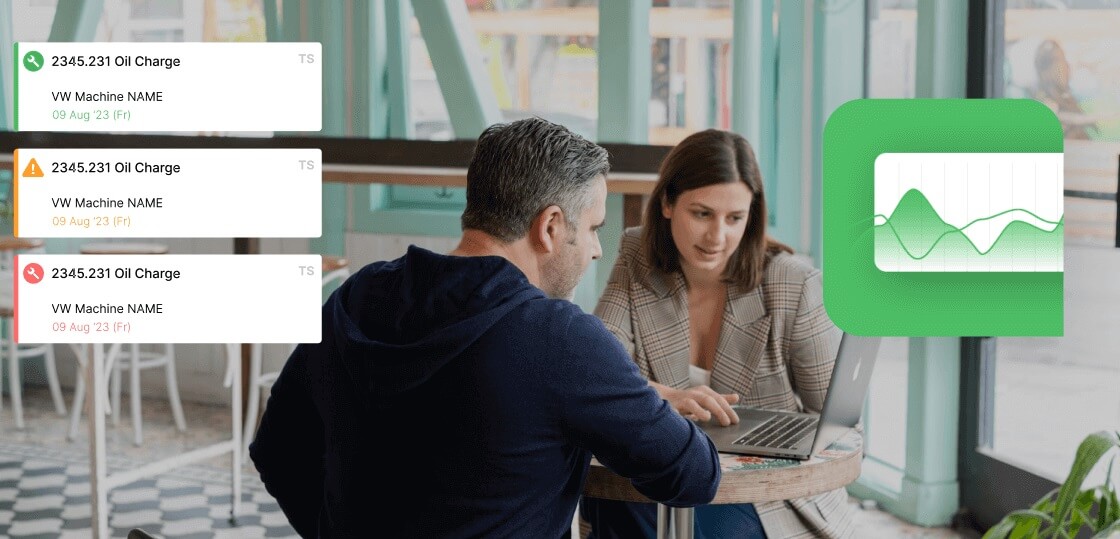
But if you want a user-friendly tool that not only tracks the downtime but empowers the operator to fix it by connecting directly to maintenance support, Fabrico offers the most complete and actionable experience for the modern shop floor.
Ready to make OEE easy?
See Fabrico's operator-friendly interface in action.
Book a Demo with Fabrico Today