Key takeaways
In most plants the energy team and the operations team rarely meet. Energy is a sustainability-and-finance conversation about kWh, peak demand, and carbon. Operations is a throughput-and-quality conversation about OEE, downtime and rejects. They share a building and almost no data.
The cost of that split is that real-world failures are visible to both teams as separate symptoms. A worn bearing pulls more current; the energy team sees a small kWh creep; the operations team sees a marginal speed loss. Neither connects them. Six months later the bearing fails, the asset stops, both teams scramble, and only then does it become obvious that the energy creep and the speed loss were the same story.
A unified picture requires only one thing the OEE side already provides: a loss taxonomy. Once every OEE event has a class, the energy team can attribute kWh to the same classes. The conversation finally fits in one number.
The right energy metric for manufacturing operations is kWh per good unit, not kWh per shift or kWh total. Raw kWh shifts with volume; per-good-unit normalises that out and surfaces the actual efficiency story.
Three reasons it works:
kWh per good unit is, in effect, the energy equivalent of OEE. It moves with the same losses and rewards the same fixes. The article on manufacturing KPIs covers the KPI families this overlaps with.
An extruder, a compressor, a packaging line that stays powered between batches. Often the asset is "running" in the OEE record because it is not stopped, but it is producing nothing. kWh per good unit goes infinite during that window. Fix: define an idle threshold tied to the OEE loss taxonomy; auto-shutdown or auto-step-down on hitting it. The connection to the preventive maintenance schedule matters because some assets degrade faster from frequent restarts, so the rule needs asset-specific tuning.
Worn bearings, partially clogged filters, drive belts at half tension. The asset runs, the line keeps producing, but the motor draws measurably more current than baseline, often enough to show up as a kWh creep before it shows up as a stop. The OEE side may register performance loss; the energy side sees the kWh creep. Either team alone misses it; together it is unmistakable. This is the classic case for the framing in root cause analysis, the leading indicators arrive before the failure.
Frequent restarts after unplanned stops add energy overhead, most pronounced on thermal and pressure systems (ovens, furnaces, compressors, extruders) that have to re-reach setpoint after every stop. The fix is in the article on the work order management system: reduce the count of small stops with cluster-threshold rules, and the restart overhead falls with them.
Auxiliary equipment, HVAC, compressors, conveyors that stay on after the line is down for the night. Often the OEE side does not see this because the line is officially stopped; the energy bill still sees it. Fix: explicit out-of-schedule rules, and a daily report of any asset drawing more than baseline during scheduled non-production windows.
Most plants already have enough meters to start. The line has a master meter; the main motors have current sensors; the air system has a pressure gauge. The framework does not need new instrumentation; it needs the existing data tied to the OEE event stream.
Six weeks of this is usually enough to reveal the kWh story per loss class. New sensors come later, when the framework has stabilised and the data justifies them. Plants that buy sensors first usually end up with high-resolution data they have no framework to interpret.
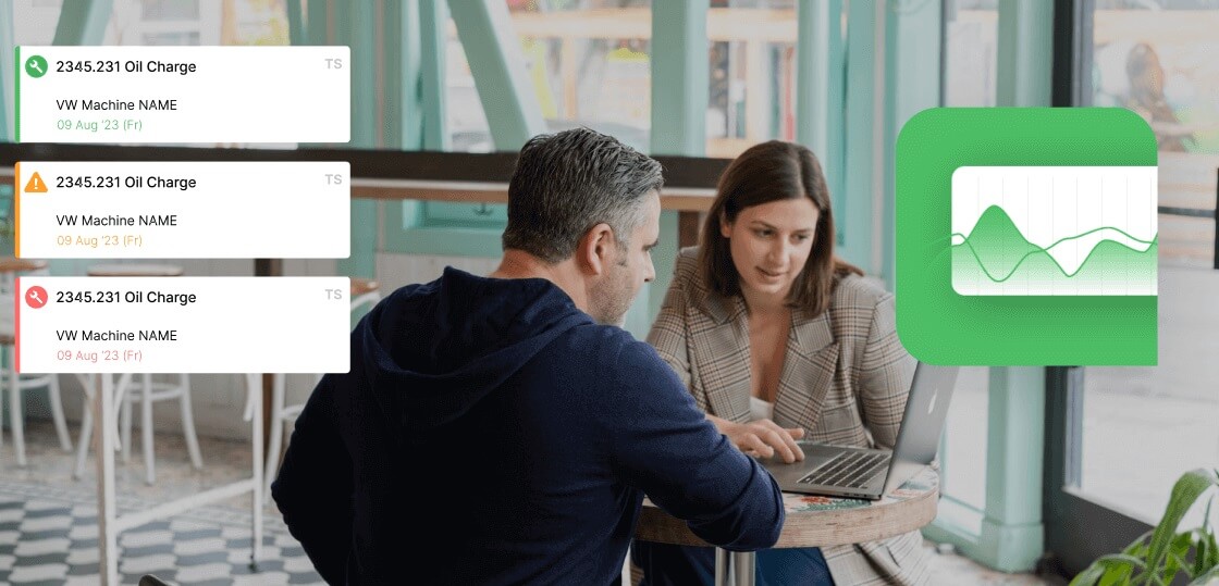
kWh per good unit goes on the same dashboard as OEE, at the same cadence. Daily for the floor. Weekly for the plant manager. Monthly for the energy team and finance. The point is to make it the same conversation, not a parallel one.
A useful supplementary metric is the kWh-per-good-unit trend by loss class, which class is improving, which is getting worse. When minor mechanical falls 12% and changeover energy rises 8%, the focus shifts; without per-class breakdown the aggregate hides the underlying story.
The framework works in any plant with a CMMS, an OEE system and existing line meters. Where a unified OEE + CMMS platform makes a difference is that the loss taxonomy, the OEE events and the work-order data are already in one place, the energy data just attaches to the same event stream, and kWh per good unit per loss class becomes a query rather than a quarterly project. Fabrico is built for that workflow. To see how the energy story would look against your live OEE data, book a demo.
No. Most plants have enough existing meters at the line and main-motor level. New sub-metering becomes useful once the framework has produced its first six weeks of data and the team knows which assets are worth instrumenting more closely.
kWh per good unit is one of the cleanest metrics to report against most ESG frameworks because it normalises for production volume. It also tracks well against year-over-year improvement claims, raw kWh can swing substantially on volume changes alone, which makes year-over-year reporting noisy.
The plant manager. The energy team produces the kWh side, the operations team produces the good-unit side, but the metric belongs to the person who can act on both. Without single ownership the framework decays into two parallel reports.
Indirectly. Peak demand spikes usually come from restart overhead and from auxiliary equipment running out of schedule. Both are addressed by the framework, but peak-demand-specific tariff optimisation is a separate exercise on top.
Tracking energy in a separate dashboard from OEE. The whole point of the framework is that the two share a loss taxonomy and a daily cadence. Splitting them across two dashboards reproduces the original problem.