Menu
OEE Dashboard: A Guide to Building Your Production Command Center

OEE Dashboard: A Guide to Building Your Production Command Center

Key Takeaways

  • A great OEE dashboard is not a static report; it's an interactive "command center" for your entire production floor.

  • The key difference is interactivity and integration. A command center doesn't just show you a problem; it allows you to click on it to launch a solution in an integrated CMMS.

  • The "best" dashboard is actually three different views tailored to the user: a strategic overview for leaders (Paula), a tactical deep-dive for managers (Mike), and a real-time scorecard for operators (Tom).

OEE Dashboard: A Guide to Building Your Production Command Center

The "Fish Tank" Problem: When Your Dashboard is a Read-Only Report

Mike has a beautiful, real-time OEE dashboard on a giant screen in his office. When a machine goes down, a big red box appears on the screen.

He calls it "the fish tank." He can watch the problems swim by, but he can't do anything about them.

The dashboard has diagnosed the problem, but it can't help him solve it. Mike still has to pick up the phone and start the chaotic, manual process of finding a technician.

His dashboard isn't a tool; it's just a pretty, expensive fish tank.

The Anatomy of a Production Command Center

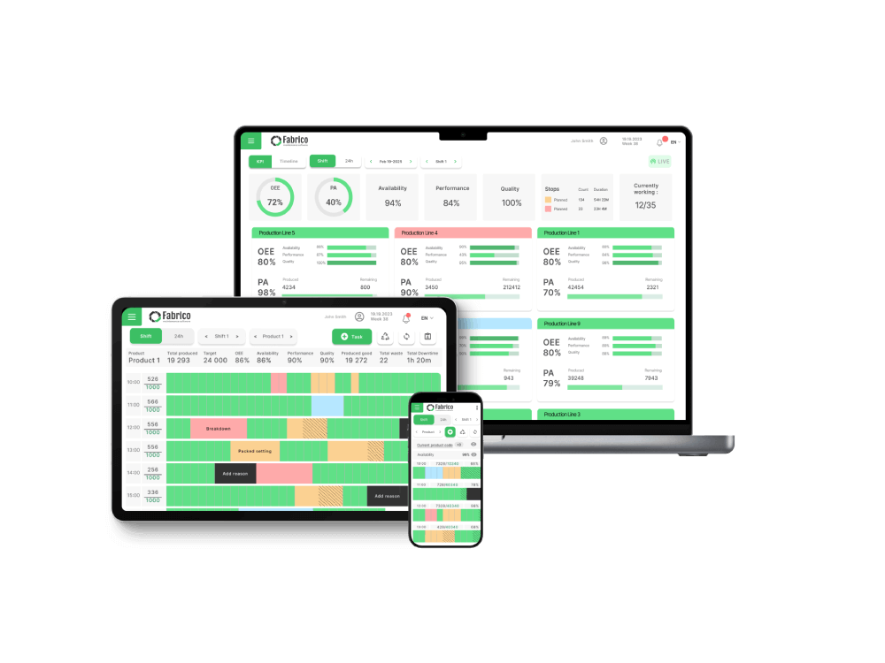
A world-class dashboard is more than a visual display; it's an interactive system designed to answer critical questions and drive action.

Component 1: The Strategic Overview ("Are we winning or losing?")

This is the high-level, 10,000-foot view for a leader like Paula. It features the overall OEE score for the plant, with clear trend lines showing performance over time.

It provides a clear, color-coded status of the entire operation at a glance.

Component 2: The Diagnostic Deep-Dive ("Why are we losing?")

This is the tactical view for a manager like Mike. This is where you find the powerful Pareto charts that instantly show your top 5 downtime reasons.

It provides a clear breakdown of the Six Big Losses, so you know exactly which category of loss is costing you the most.

Component 3: The Real-Time Production Tracker ("How are we doing right now?")

This is the operational view for an operator like Tom. It's a simple, live count of units produced versus the target for the current shift.

This provides immediate, motivating feedback and a clear goal to work towards.

The Command Center Difference: From Insight to Action

This is the most important part. This is what separates a passive fish tank from an active command center.

The Diagnosis is Just the Beginning

Any basic dashboard can show you a red box when a machine stops. That's the easy part.

The Cure is a Click Away (The Fabrico Workflow)

In a true command center, the diagnosis is the starting point for the solution. When Mike sees the downtime event for "Press #4" on his dashboard, he doesn't pick up the phone.

He clicks on the red box.

This single action instantly opens a pre-filled work order in the integrated CMMS. He confirms the details, assigns it to the right technician, and the cure has been launched.

This is the difference between seeing a problem and solving it.

Not One Dashboard, But Three: Tailoring the View to the User

A true solution recognizes that a "one-size-fits-all" dashboard doesn't work. It provides different views for different roles.

Paula's View (The Director)

Paula needs to see high-level trends, cross-site performance comparisons, and the financial impact of OEE on profitability.

Mike's View (The Manager)

Mike needs tactical drill-downs, deep downtime analysis, and a live view of his maintenance team's response KPIs, like Mean Time to Repair (MTTR).

Tom's View (The Operator)

Tom needs a simple, clear scorecard for his specific line. It should show real-time progress against the shift's goal, empowering him to own his performance.

Frequently Asked Questions (FAQ)

What is the most important KPI on an OEE dashboard?

The overall OEE score is the top-level indicator. However, the most actionable KPIs are often the Pareto charts that show your top 3-5 specific downtime reasons, as these tell you exactly where to focus your improvement efforts.

How should you display OEE dashboards on the shop floor?

Use large, highly visible screens in common areas. The display should be simple and clear, focusing on the team's real-time production count versus their target for the shift to create engagement and a sense of winning.

Can you customize the dashboards in Fabrico?

Yes. Fabrico allows you to create and save custom dashboard views, filter by date, shift, or asset, and tailor the information to the specific needs of each user role.

Stop Building Fish Tanks. Start Building a Command Center.

Don't settle for a passive dashboard that only tells you that you're losing.

Invest in an integrated command center that empowers your team to take the actions they need to win.

Ready to see what a true production command center looks like in action?

Book a personalized demo of Fabrico today.

Latest from our blog

Still Wondering?
Check for Yourself!
Still Wondering?

Schedule a 1-to-1 meeting with our experts or directly enroll in our Free Plan.
No Credit Card required!

By clicking the Accept button, you are giving your consent to the use of cookies when accessing this website and utilizing our services. To learn more about how cookies are used and managed, please refer to our Privacy Policy and Cookies Declaration