A world-class report isn't about overwhelming you with data. It's about providing clear answers and a direct path to a solution. Here are the essential components.
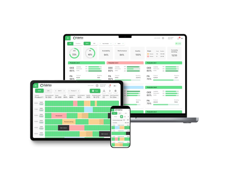
Component 1: The Executive Summary (OEE, A, P, Q Trends)
What it is: A high-level view of your overall OEE score, plus the individual scores for Availability, Performance, and Quality. Crucially, these are shown as a trend over time (e.g., week-over-week).
The Diagnosis it gives you: This is the 10,000-foot view of plant health, perfect for a leader like Paula. It instantly shows if overall efficiency is improving, declining, or stagnating.
The Actionable Cure: In a modern system like Fabrico, this isn't just a static chart. If Paula sees the Availability trend has dipped by 5%, she doesn't have to email Mike and wait for an answer.
She can click on that data point to instantly drill down into the detailed downtime analysis for that specific period. It turns a question into an immediate answer.
Component 2: The Downtime Deep-Dive (Pareto Analysis)
What it is: A simple chart or list that identifies your top 5 downtime reasons by both how often they happen and how long they last. This is often called a Pareto analysis, focusing on the "vital few" problems.
The Diagnosis it gives you: It tells you exactly which one or two problems are causing 80% of your production losses. It stops your team from wasting precious time and resources fixing minor issues.
The Actionable Cure: This is where the report connects to real work. When a Maintenance Manager like Mike sees that "Bearing Failure on Machine 7" was his #1 downtime cause last week, he doesn't just add it to a list for discussion.
In Fabrico, he can click on that reason, see all the related historical work orders, and immediately create a new Preventive Maintenance task in the CMMS to increase the inspection frequency for that specific component.
Component 3: The Production Analysis (Actual vs. Target)
What it is: A clear comparison of the total units you produced versus your production target. It also shows the total number of good units versus the number of rejects.
The Diagnosis it gives you: This directly shows how your OEE performance is impacting your ability to meet shipping deadlines and highlights the real financial cost of poor quality.
The Actionable Cure: When a report shows a high number of rejects during a specific product run, it shouldn't be just a historical fact. In an integrated system, this data is linked to the specific machine and work order.
This allows managers to quickly investigate if there's a machine that needs calibration or an operator who needs more training, and then assign those corrective tasks directly through the CMMS.