

The I-MR chart, also called the individuals and moving range chart, is a pair of statistical process control charts used when a process yields only one measurement per batch, hour, or time period: the I chart plots each individual value, and the MR chart plots the absolute difference between consecutive values.
It answers the same question every control chart answers: is the process stable, or has something changed? Because there is no subgroup to average, the I-MR chart estimates variation from point-to-point differences instead. That makes it the workhorse chart for batch chemistry, low-volume machining, utilities data, and any destructive or expensive test.
The classic X-bar and R chart assumes you can pull rational subgroups of 3 to 5 consecutive parts. Plenty of processes cannot deliver that. A resin reactor yields one pH value per batch. A furnace logs one temperature per hour. A destructive tensile test consumes a full part every time you run it.
Forcing such data into artificial subgroups mixes batch-to-batch variation into the within-subgroup estimate and produces control limits that are either uselessly wide or misleadingly tight.
The I-MR chart sidesteps this by treating each measurement as a subgroup of one and estimating short-term variation from the moving range between neighbouring points. If control charting is new to you, our guide to statistical process control covers the family; the I-MR chart is simply its individuals-data member.
Always check the MR chart first. The I chart limits are calculated from the average moving range, so if variability itself is unstable, the I chart limits are built on sand and any conclusion about the process level is suspect.
Those two constants, 2.66 and 3.267, are the only ones you need to memorise for the I-MR chart.
A coatings plant measures pH once per batch. The last ten batches read: 6.2, 6.4, 6.1, 6.5, 6.3, 6.6, 6.2, 6.4, 6.3, 6.5. (Ten points keeps the maths readable; collect 20 to 25 before locking limits in production.)
Every individual value sits between 5.67 and 7.03, and the largest moving range (0.4) is well under 0.84: the process is in statistical control. But control is not capability. The estimated standard deviation is 0.256 / 1.128 = 0.23, so the natural process spread runs roughly 5.67 to 7.03.
If the specification is 6.0 to 6.8, the process is stable yet wider than the spec, which is exactly what a process capability study with Cp and Cpk would quantify next.
If you can economically take subgroups of consecutive parts, X-bar and R charts detect small shifts faster because averaging suppresses noise. Choose I-MR when measurements are expensive, destructive, or naturally one per period, and accept that it flags subtle shifts more slowly. The individuals chart is also more sensitive to non-normal data than an averages chart, so review a histogram of your baseline before trusting the limits.
An I-MR chart is only as good as the data feeding it and the action that follows a signal. Fabrico provides the real-time data foundation: it captures machine and production events as they happen, using computer vision even on machines with no PLC, and turns them into live OEE and production monitoring.
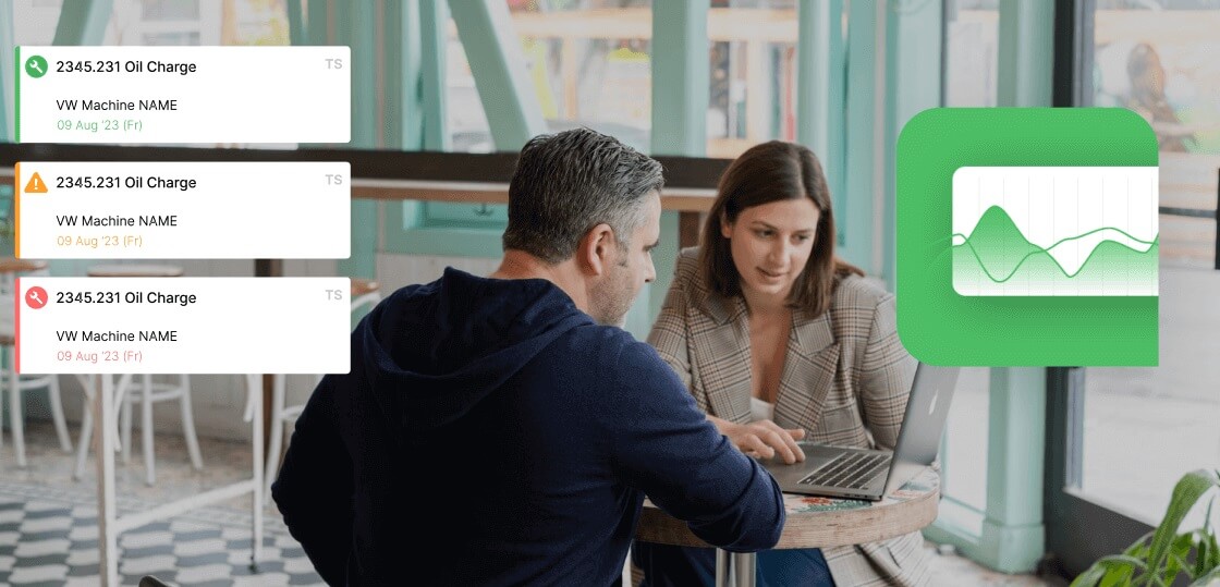
When a chart or an operator flags a problem, Fabrico's CMMS follows through: raise a work order, attach findings, schedule the preventive follow-up, and keep the spare parts trail in one place.
Built in the EU with EU data residency, it gives quality and maintenance teams one shared, timestamped record instead of paper log sheets, which is exactly what SPC needs to work on a real shop floor.
Aim for 20 to 25 individual readings collected under stable, representative conditions. You can plot provisional limits with fewer points to start learning, but treat them as trial limits and recalculate once you have a full baseline; limits built on ten points can shift noticeably as data accumulates.
Control limits are calculated from your own process data and describe what the process actually does; specification limits come from the customer or the drawing and describe what the product must be. Never draw spec limits on a control chart. As the worked example shows, a process can be perfectly in control and still produce out-of-spec parts.
With caution. The individuals chart has no averaging to soften departures from normality, so heavily skewed data such as cycle times or trace impurity levels will trigger false alarms on one side. Common fixes are transforming the data, fitting limits from an appropriate non-normal distribution, or charting a related metric that is closer to normal.
Ready to put reliable, timestamped shop floor data behind your control charts? Book a Fabrico demo and see real-time production monitoring and maintenance working as one system.
See how Fabrico unifies OEE and maintenance in one platform.
Request a demo


















 Login
Login
 Blog
Blog