Menu
Pareto Analysis in Manufacturing: Fixing the Vital Few

Pareto Analysis in Manufacturing: Fixing the Vital Few

Pareto analysis ranks problems so you fix the vital few causes driving most of the loss, not the trivial many. How to build one and the traps that mislead it.
Pareto Analysis in Manufacturing: Fixing the Vital Few

Key takeaways

  • Pareto analysis ranks causes of loss by impact so you attack the "vital few" that drive most of the problem, instead of spreading effort across the "trivial many."
  • It rests on the common observation that a small share of causes accounts for a large share of the loss. Fixing the top two or three causes usually beats touching all of them.
  • A Pareto chart is only as honest as its inputs. If downtime reasons are guessed, the chart confidently points at the wrong cause.
  • Rank by total impact (time or cost), not by how often something happens. A frequent but trivial stop can outrank a rare but devastating one on a raw count, which misleads.

What Pareto analysis is

Pareto analysis is the discipline of sorting problems by size and working the biggest first. Plotted as a chart, the causes line up from largest to smallest with a cumulative curve, and the picture is almost always the same: a few causes tower over a long tail of small ones. The practical message is to ignore the tail until the head is fixed.

It is the natural partner to production loss analysis: loss analysis tells you what the losses are, Pareto tells you which to fight first.

How to build one

  1. Categorise the losses into consistent causes (a clean reason list matters here).
  2. Total each cause by impact, usually minutes of downtime or cost, not by count.
  3. Sort largest to smallest and add a cumulative line.
  4. Attack the top causes until the cumulative curve shows you have covered most of the loss, then stop and re-measure.

The data-quality dependency

This is where most Pareto analyses quietly fail. The chart looks authoritative regardless of whether the underlying reasons are accurate. If operators picked the nearest reason code under pressure, the chart over-weights the easy-to-click categories and hides the real driver in a generic bucket. A beautiful Pareto built on guessed data sends the whole team after the wrong cause. Accurate capture, covered in automatic downtime tracking, is the precondition.

Common mistakes

  • Ranking by frequency, not impact. Twenty trivial one-minute stops can outrank a single two-hour breakdown on a count, pointing effort at the wrong place. Rank by total time or cost.
  • Trusting bad reason data. The chart cannot be better than its inputs; confident conclusions from guessed codes are worse than none.
  • Re-paretoing forever. The point is to act on the top causes, not to keep re-drawing the chart. Fix, then re-measure.
  • Categories too broad. A giant "other" or "minor stops" bucket hides the real number-one cause inside it.

How Fabrico fits

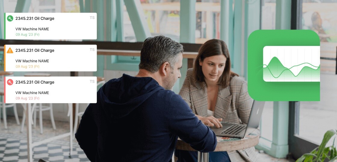
Fabrico builds the Pareto from automatically captured downtime with true causes, ranked by actual time lost, so the chart reflects what really happened rather than what was convenient to log. Because the same data drives OEE and the work-order system, the top Pareto cause can move straight into a tracked investigation and fix. Fabrico is built and hosted in the EU with data residency in mind and is ISO 27001 certified. To see your real vital-few losses, book a demo.

Related reading

To turn this into a tool decision, see our overview of the root cause analysis software.

Many manufacturers pair these methods with the cost of poor quality.

Frequently asked questions

What is the 80/20 idea behind Pareto analysis?

The observation that a small share of causes tends to account for a large share of the effect. In a factory, a few loss causes usually drive most of the lost time, so fixing those few delivers most of the gain. The exact ratio varies; the principle holds.

Should I rank causes by frequency or by impact?

By impact (total time or cost), not by how often they occur. A frequent but minor stop can dominate a raw count while contributing little total loss, which would send your effort to the wrong place. Total impact is what matters.

Why do Pareto charts mislead?

Almost always because of bad input data. If downtime reasons were guessed, the chart over-weights easy-to-select categories and buries the real cause. The chart looks convincing either way, which is what makes inaccurate reason data so dangerous.

How does Pareto relate to production loss analysis?

Loss analysis identifies and categorises where output is lost; Pareto ranks those losses so you tackle the biggest first. They are used together: analyse the losses, then Pareto them to prioritise the work.

Latest from our blog

Define Your Reliability Roadmap
Validate Your Potential ROI: Book a Live Demo
Define Your Reliability Roadmap
By clicking the Accept button, you are giving your consent to the use of cookies when accessing this website and utilizing our services. To learn more about how cookies are used and managed, please refer to our Privacy Policy and Cookies Declaration