Key takeaways

The 3-Second Rule: A good manufacturing dashboard must answer "Are we winning or losing?" in less than 3 seconds from 10 feet away.
Don't "Data Puke": Overloading a screen with 20 charts confuses operators. Show only the 3 metrics that matter right now (Availability, Performance, Target).
See how Fabrico unifies OEE and maintenance in one platform.
Book a demoThe "Timeline" is King: Bar charts show history; Timelines (Gantt charts) show the rhythm of the shift, highlighting micro-stops.
Action Over Status: The best dashboards don't just turn red; they tell you what to do (e.g., "Clean Sensor A").
An OEE dashboard is a single visual screen that turns raw machine data into one honest number for how much good product a line actually made versus its theoretical maximum. It exists to make losses obvious in seconds, so an operator, supervisor, or plant manager can see a problem and act on it before the shift ends.
The number it visualizes comes from one formula:
OEE = Availability x Performance x Quality
Because a single OEE figure hides the cause, a useful dashboard never stops at the percentage.
At a minimum it should surface a live OEE score against target, the three component factors broken out, a ranked loss or downtime reason breakdown, and a short trend line (typically 7 to 14 days) so a dip is read as a pattern, not a one-off.
For a deeper look at the underlying metrics, see our guide to OEE KPIs . The five examples below each choose a different subset of these signals for a different audience.
Each archetype below optimizes for one job. Use this table to match a dashboard to the person standing in front of it and the decision they need to make.
| Dashboard type | Primary audience | Best for | Headline metric |
|---|---|---|---|
| Andon Scoreboard | Line operators | Real time motivation and a shared target | Live OEE vs target |
| Timeline | Process engineers | Diagnosing when and why stops happened | Stop and state timeline |
| Pareto Attack | Shift huddle teams | Prioritizing the biggest loss to fix first | Ranked loss reasons |
| Plan vs Actual Hourly | Supervisors | Pacing output against schedule attainment | Hourly actual vs plan |
| Action Center | Cross functional teams | Turning a loss into an assigned task | Loss linked to owned action |
The pattern across all five: the best dashboard is the one that shortens the distance between seeing a loss and closing it. To connect these views to shop floor practice, see our overview of OEE for manufacturing.
At a minimum: a live OEE score against a target, the three component factors (Availability, Performance, Quality) broken out, a ranked breakdown of downtime and loss reasons, and a trend line covering the last 7 to 14 days. Anything beyond that should serve a specific decision the viewer needs to make.
OEE is the product of three factors: OEE = Availability x Performance x Quality. Availability is producing time divided by planned time, Performance is actual output divided by the ideal output at rated speed, and Quality is good parts divided by total parts. Each factor is a percentage, so multiplying them gives a single percentage.
Interpretation matters more than a universal benchmark. A score is only meaningful against your own line's history and its realistic capacity, so track the trend and the gap to your own target rather than chasing an external figure. What counts as strong for a high mix job shop differs from a continuous packaging line.
Start from the decision, not the data. Pick the one viewer and the one action the screen must drive, capture clean state and reason data from the equipment, compute the three factors, then display only the few signals that lead to that action. Validate it by asking whether someone can spot the top loss in under three seconds from across the room.
The most dangerous thing in a factory is a TV screen that no one looks at.
We have all seen it: A 65-inch monitor mounted high on a wall, covered in complex pie charts, tiny numbers, and spinning dials. It looks impressive to investors, but the operators on the floor ignore it completely.
Why? Because it is "Wallpaper Data." It is there, but it doesn't help them do their job.
An OEE dashboard is not just a report; it is a user interface for your factory. It needs to drive behavior.
Here are the 5 essential OEE dashboard types you should consider, ranked by their ability to actually improve production.
The Concept: Big, bold, simple.
This is the classic "Football Scoreboard" approach. It usually displays just three numbers:
Target Count (Where we should be).
Actual Count (Where we are).
Efficiency % (OEE).
Why it works:
It taps into basic human psychology. If the "Actual" number is green, the team feels good. If it turns red, they naturally speed up. It requires zero training to understand.
The Fabrico Take:
We support this view for overhead TVs. However, ensure the "Target" adjusts dynamically for breaks/changeovers, or operators will ignore it.
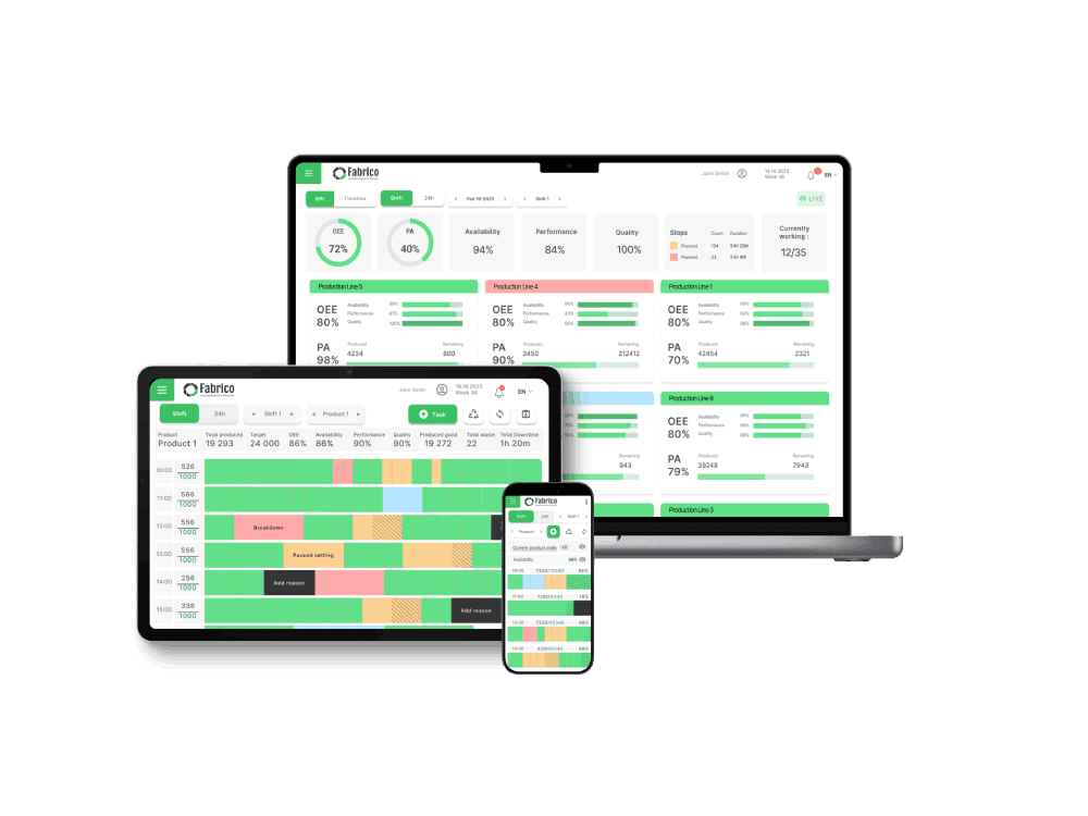
The Concept: A horizontal Gantt chart showing the last 8 hours.
Green bar = Running.
Red bar = Down.
Yellow bar = Micro-stop/Slow.
Why it works:
This is the single most valuable view for identifying Micro-Stops. A bar chart hides short stops; a timeline exposes them as "fuzz" or gaps in the green bar. It allows an engineer to look at the screen and say, "We aren't breaking down, but we are stuttering every 5 minutes."
The Fabrico Advantage:
Fabrico allows you to click on any red sliver in the timeline and "Zoom-In" to see the video clip of that specific moment.
The Concept: A sorted bar chart of the Top 5 Downtime Reasons for the current shift.
Example: Bar 1: "Labeler Jam" (45 min). Bar 2: "No Material" (10 min).
Why it works:
This is essential for the Daily Standup or Shift Handover. It forces the team to focus on the "Big Rock." It prevents the debate of "What went wrong?" and moves straight to "How do we fix the Labeler?"
The Fabrico Take:
Don't wait for the end of the shift. If one bar grows too fast (e.g., >20 mins), the Fabrico Agent should alert the Maintenance Lead immediately.
The Concept: A chart showing hour-by-hour output.
Hour 1: 100 units (Goal met).
Hour 2: 80 units (Miss).
Hour 3: 0 units (Changeover).
Why it works:
It breaks the daunting 8-hour shift into manageable "sprints." If the team loses Hour 2, they can rally to win Hour 3. It prevents the "We'll make it up later" mentality that leads to missed quotas.
The Concept: This is where Fabrico differs from generic BI tools (like PowerBI).
Most dashboards are Passive (Here is the data). The Action Center is Active.
It displays:
The OEE Score.
The Active Task: "Machine is Down - Operator: Please Scan QR Code."
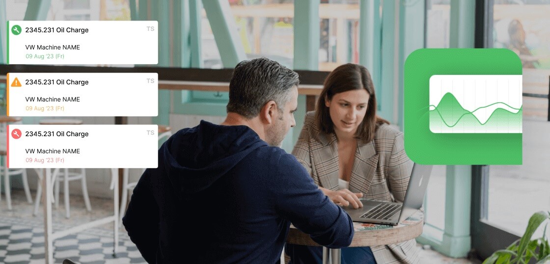
The Maintenance Trigger: "Performance Low - Tech Dispatched to check heater bands."
Why it works:
It doesn't just inform; it instructs. It bridges the gap between "OEE" and "CMMS." It turns the screen into a member of the team.
Many Plant Managers try to build their own OEE dashboards using PowerBI or Excel. This usually fails for three reasons:
Latency: The data is often 15 minutes (or 24 hours) old.
Font Size: They design it on a laptop. When put on a TV 20 feet away, the text is unreadable.
No Interactivity: You can't tap a TV screen to assign a downtime code.
When choosing OEE software, don't look at the "Executive Reporting" first. Look at the "Operator HUD."
If the screen is cluttered, confusing, or ugly, your operators will ignore it. If it is clean, gamified, and actionable, they will own it.
Stop building wallpapers. Start building workflows. [See Fabrico's Dashboard Gallery].
See OEE & CMMS live in 15 minutes.
Book a demoCurious what honest, real-time OEE looks like on your floor?
Watch a 15-min demo













 Login
Login
 Blog
Blog