
Диаграма тип „спагети“ е прост лийн инструмент, който проследява действителния физически път, който човек, детайл или продукт изминава в рамките на съоръжението, начертан като непрекъсната линия върху мащабен план на помещението. Заплетените припокриващи се линии, които обикновено възникват, приличат на спагети, откъдето идва и името.
Чрез визуализиране на движението на хората и потока на материалите, диаграмата тип „спагети“ разкрива загубите от движение и транспорт , които са на показ на всеки производствен под, и ви дава конкретна базова дистанция, спрямо която да се подобрявате.
Диаграмата тип „спагети“ е насочена към два от класическите седемте вида загуби в лийн производството: движение (излишно придвижване на хора) и транспорт (излишно преместване на материали). Тези загуби рядко се отразяват в отчет за разходите, но консумират време на оператора, увеличават риска при манипулация и удължават времето за изпълнение.
Работник, който изминава допълнителни 400 метра на смяна, за да вземе инструменти, да провери екран или да премести контейнер, не добавя стойност към продукта, докато губи реални минути. Диаграмата преобразува това невидимо движение в измерима линия, която можете да преброите и съкратите.
Необходими са ви молив, хронометър и мащабна скица на работната зона. Методът е умишлено нискотехнологичен, за да може всеки да го приложи.
Наблюдавайте това, което реално се случва, а не това, което стандартът казва, че трябва да се случи. Пропастта между двете е мястото за подобрение и тя директно захранва по-добрата стандартна работа.
Вземете за пример опаковъчна станция. Операторът изпълнява 60 поръчки на смяна. За всяка поръчка текущото разположение налага следния маршрут:
Общо 25 метра на поръчка. При 60 поръчки операторът изминава 25 x 60 = 1 500 метра на смяна, приблизително 1,5 километра само в рамките на една станция. При средна скорост на ходене около 1 метър в секунда това са 1 500 секунди, или 25 минути чисто ходене на смяна.
След прерисуване на диаграмата екипът премества принтера за етикети и диспенсъра за лента до работната маса и позиционира палетата за изпращане на разстояние 2 метра. Новият маршрут е:
Сега операторът изминава 2 метра на поръчка, т.е. 2 x 60 = 120 метра на смяна. Разстоянието за ходене пада от 1 500 на 120 метра, намаление от 1 380 метра или 92 процента. Възстановените 25 минути на смяна, при 250 работни дни, се равняват на над 100 часа операторско време годишно, освободено за стойностно-добавяща работа.
След като е начертана, няколко модела изпъкват. Плътни клъстери от пресичащи се линии сигнализират за тапи или зле разположен ресурс. Дълги прави участъци между две точки сочат кандидати за преместване. Обратно проследяване, където линията се припокрива сама, почти винаги означава несъответствие между последователността на процеса и физическото разположение.
Диаграмата тип „спагети“ се допълва добре от Парето-преглед: подредете преместванията по честота и разстояние и атакувайте първо най-дългите и най-повтарящите се участъци, същата логика зад анализ на Парето.
Най-често използваното решение е преминаване от разпръсната, базирана на отдели подредба към клетъчна или U-образна конфигурация, където машини и материали са подредени в процесна последователност. Добре проектирана клетка съкращава пътуванията, държи оператора в компактна верига и прави потока видим.
Тази физическа пренастройка е основна част от визуалното управление, защото самото разположение комуникира как трябва да се движи работата. Диаграмата тип „спагети“ е начинът да докажете, че клетката си е струвала: начертайте я отново след промяната и пребройте премахнатите метри.
Диаграмата тип „спагети“ е моментна снимка, направена ръчно в един ден. Нейната сила е скоростта и простотата; нейният лимит е, че улавя едно наблюдение, а не непрекъсната реалност. Загубите от движение се променят с продуктовия микс, персонала и наличността на машините, и еднократна рисунка не може да види тези промени.
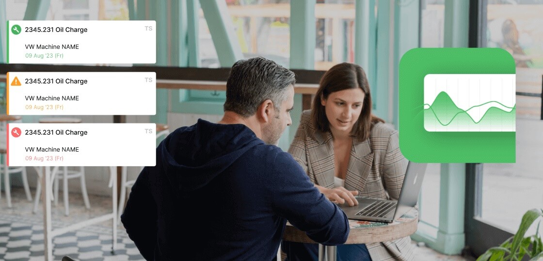
Fabrico не е инструмент за проследяване на движение или симулация на разположение и не изпълнява симулации на дигитален близнак. Това, което прави, е да осигури производствените данни, които ви казват къде да насочите вашето спагети проучване първоначално.
Мониторингът на OEE в реално време на Fabrico показва кои станции губят най-много време заради микро-спирания и бавни цикли, включително камерно наблюдение на машини без PLC. Тъй като загубите ерозират Общата ефективност на оборудването, станциите, които снижават OEE, обикновено са същите, които си струва да бъдат картографирани ръчно.
Премахването на движението веднъж е лесно; запазването му е трудната част. Закрепете новото разположение в стандартната работа, маркирайте местата за инструменти и материали с подова лента и прерисувайте диаграмата след всяко отклонение в подредбата.
Сдвоете физичното проучване с непрекъснати цифрови данни, така че когато времената на цикъла на дадена станция започнат да се увеличават, да знаете да вземете молив и да проверите пода отново. Ръчно начертаният план и живото табло се подсилват взаимно: едното ви казва пътя, другото, темпото.
Диаграмата тип „спагети“ показва физическия път на придвижване върху реален подов план, за да разкрие загуби от движение и транспорт в една станция или зона. Картата на стойностния поток е по-широка и по-абстрактна: тя очертава потока на материали и информация през целия процес, включително водещи времена, запаси и времена на цикъл.
Използвайте диаграмата тип „спагети“ за детайлни проблеми с разположението и картата на стойностния поток за потока от край до край.
За една станция или оператор базова диаграма тип „спагети“ отнема около 30 до 90 минути: няколко минути за скициране на плана и останалото за наблюдение на един или повече пълни цикъла. Комплексни зони с много оператори може да изискват няколко сесии на наблюдение в различни смени, за да се улови типичното движение, а не късметлийски или нещастен ден.
Софтуерът не може напълно да замени директното наблюдение, което прави диаграмата тип „спагети“ ценна, защото стоенето на пода разкрива контекст, който един сензор пропуска. Това, което производствените данни правят, е да таргетират проучването: мониторингът показва кои активи и станции губят най-много време, за да картографирате зоните, които имат значение. Ръчно начертяната диаграма и непрекъснатите CMMS и OEE данни работят заедно, а не едно да замества другото.
Готови ли сте да видите кои станции си струва да бъдат картографирани? Мониторингът на OEE и производството в реално време на Fabrico локализира вашите най-големи загуби на време, така че усилията за подобрение да попаднат там, където имат значение. Резервирайте демонстрация на Fabrico, за да превърнете данните от пода в по-малко изразходвани метри и по-висок пропусквателен капацитет.
Вижте как Fabrico обединява OEE и поддръжката в една платформа.
Насрочете демо




 Вход
Вход
 Блог
Блог