


 Login
 Blog

OEE Reports: What OEE Reporting Software Should Produce, for Whom and When

Key Takeaways
-
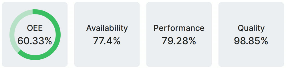
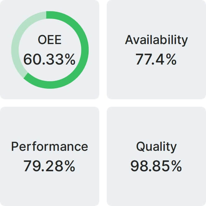
An OEE report shows OEE, availability, performance and quality for a line and a period, plus the losses behind the score.
-
OEE reporting software should produce four views: a live shift view, a daily loss list, a weekly trend and a monthly comparison. Each has one reader and one decision.
-
In a demo, ask the vendor to rebuild one shift from raw events, then follow the top loss to the person who owns it.
See how to calculate the OEE metric this report is built on.
The "So What?" Problem: When Your OEE Report is Just a Data Dump
The plant manager gets the weekly OEE report in her inbox.
It’s a 10-page PDF filled with charts and numbers. Her eyes land on the key metric: OEE on Line 2 was only 55% last week.
The report tells her what happened. It doesn't tell her why. And it doesn't tell her who is working on the biggest loss.
The report is a data dump with no "so what." It raises questions but provides no actionable answers.
Which OEE Report, for Whom, and When
OEE reporting software should not send one report to everyone. Start from four views, each with one reader and one decision.
| Report | Reader and timing | What it shows | Decision it supports |
|---|---|---|---|
| Live shift view | Shift supervisor, during the shift | Line status, the current stop and its length, output against target by hour, live OEE | Go to the line now, or call for help |
| Daily loss list | Shift leads and production manager, at the morning meeting | Yesterday's OEE by line and shift with the three factors, the top losses in minutes, stops with no reason | Who owns the top loss today |
| Weekly trend | Production, CI and maintenance managers, once a week | OEE and the three factors by week, stop reasons by count and minutes, the machines with the most downtime | Which repeat loss gets the next fix, and did the last fix hold |
| Monthly comparison | Plant leadership, once a month | OEE trend by line and plant on one set of definitions, output against target | Where to spend engineering time and money next |
For the one page that closes a shift, use our shift production report template.
What Goes in an OEE Report: Three Blocks
Whichever view you read, the content comes from the same three blocks. If a report does not answer these three, ask for it to be changed.
Component 1: The Executive Summary (OEE, A, P, Q Trends)
What it is: A high-level view of your overall OEE score, plus the individual scores for Availability, Performance, and Quality. Crucially, these are shown as a trend over time (e.g., week-over-week).
The Diagnosis it gives you: This is the view for plant leadership. It shows whether the score is improving, falling or flat, and which of the three factors is moving it.
What to do with it: Look at the factor that moved first. If Availability dips, open the top stoppages for that period. If Performance dips, look at short stops and slow cycles.
Component 2: The Downtime Deep-Dive (Pareto Analysis)
What it is: A simple chart or list that identifies your top 5 downtime reasons by both how often they happen and how long they last. This is often called a Pareto analysis, focusing on the "vital few" problems.
The Diagnosis it gives you: It shows which few reasons take the most minutes, so the team works on those first and not on minor issues. Our guide to the downtime report covers this block in more depth.
What to do with it: Give the top loss one owner and one next step, then check next week's list to see if it moved.
Component 3: The Production Analysis (Actual vs. Target)
What it is: A clear comparison of the total units you produced versus your production target. It also shows the total number of good units versus the number of rejects.
The Diagnosis it gives you: This directly shows how your OEE performance is impacting your ability to meet shipping deadlines and highlights the real financial cost of poor quality.
What to do with it: When rejects spike during one product run, compare that run with others on the same machine. Check the changeover and the startup rejects first, then the settings, before you look at people.
Static Reports vs. Live Views: You Need Both
Static reports (Excel, PDF): A fixed snapshot of a period. Good for a record, a monthly review or your own analysis. A new question usually needs a new export.
Live views: A screen you can filter by line, shift and period. Good during the shift and in the meeting.
Good OEE reporting software gives you both. See real-time OEE vs end-of-shift reporting for the timing, and these OEE dashboard examples for the screens.
What to Test in a Demo of OEE Reporting Software
Most demos show a clean chart on clean data. These seven tests show what the report will do on a real shift.
- Rebuild one shift. Ask for the raw stops and counts behind one report, and work out availability, performance and quality by hand. The numbers should match.
- Find the definitions. Where are planned time and the ideal cycle time set for each product? If someone changes one, what happens to past reports?
- Follow a short stop. Who sets the shortest stop that counts? Does it show in Performance or in Availability, and can you see it as its own event?
- Look for the missing reasons. How does the report show stop time with no reason? A chart that hides it looks better than the line is.
- Check the roll-up. How do machines roll up to a line and a plant? Averaging percentages gives a different answer from adding up minutes.
- Get the data out. Export one week of raw events to Excel or through an API. Then ask who can build a new report, and whether that is included.
- Follow the top loss. Take the biggest loss in the report and ask who sees it, how they are told, and how it becomes someone's job.
What Fabrico Reports Cover, and What They Do Not
We sell Fabrico, an MES and OEE platform, so test these lines in a demo like any other vendor's.
Fabrico analytics and reporting covers OEE, production achievement, TEEP and equipment utilization, top stoppages and downtime distribution, by hour, shift, day, week or month, with export to Excel. Figures come from PLCs, IoT sensors or cameras, or manual mode on lines without sensors, plus the reasons operators tag.
Fabrico has no formal root cause workflow. AI cameras can suggest a likely reason and the operator confirms it, and finding the root cause stays a job for your team. A stoppage reason can be configured to open a maintenance task automatically, and people can also create tasks by hand.
Frequently Asked Questions (FAQ)
How often should we generate OEE reports (daily, weekly, monthly)?
Use a live view during the shift and a daily loss list for the morning meeting. A weekly report suits production and maintenance teams looking for trends. A monthly or quarterly report suits leadership.
Who should be receiving OEE reports?
Different roles need different views. Shift supervisors need live, on-the-floor data. Operations and maintenance managers need weekly trend and downtime reports. Plant leadership needs a monthly summary. Ask each vendor how a view is set up for each audience.
Can you create custom OEE reports in Fabrico?
Standard reports run by hour, shift, day, week or month and export to Excel. Dashboards can be customized for your company as a whole, not per user. A custom report builder is available as an add-on.
What is the difference between an OEE report and an OEE dashboard?
A dashboard is a live screen for people who can act now. A report is a fixed view of a period, made for a review or a record. See our guide to the OEE dashboard.
Is Excel enough for OEE reporting?
On one line with clean data, it can be. The weak spot is the input: stops and counts typed in after the shift usually miss the short stops, and someone has to build the report each time. Excel stays useful as an export from reporting software.
Take One Real Shift to the Demo
An OEE report earns its place when someone changes what they do after reading it. If yours end up unread in an inbox, start with the four views above and the seven tests.
Want to run those tests on Fabrico? Book a demo below, or contact us with your questions first.
Turn downtime into a number your team can actually act on.
Request a demoRelated articles







Real Fabrico tiles, sample data.